
I saw this graffiti on my way to work and I stopped and took a picture of it even though it didn’t seem all that interesting. It’s pretty well done–I’ll admit that. The letters look very solid, the lines are clean, and I like the use of different shades of blue as well as the yellow clouds and red dots. I had to step back a bit to see that it spells SNARE and I thought, oh, cute, you caught me. But I can scroll through Instagram for pictures of Nashville graffiti, or even go farther afield–around the United States, even around the world–and see graffiti that uses the same style of lettering. Along with bubble letters this more, well, I don’t know how to describe it, but it seems more chiseled than bubble letters, with contrasting curves and sharp points, seems to be pretty standard. It’s a style a lot of artists use.
But then I thought, well, that’s okay. I don’t remember who it was that said “Originality is overrated.” Maybe it was several different people–some of the same ones who said “Great minds think alike.” I focused on this detail and thought, as many different artists paint and draw inspiration from each other, there’s bound to be overlap. Especially if they’re…
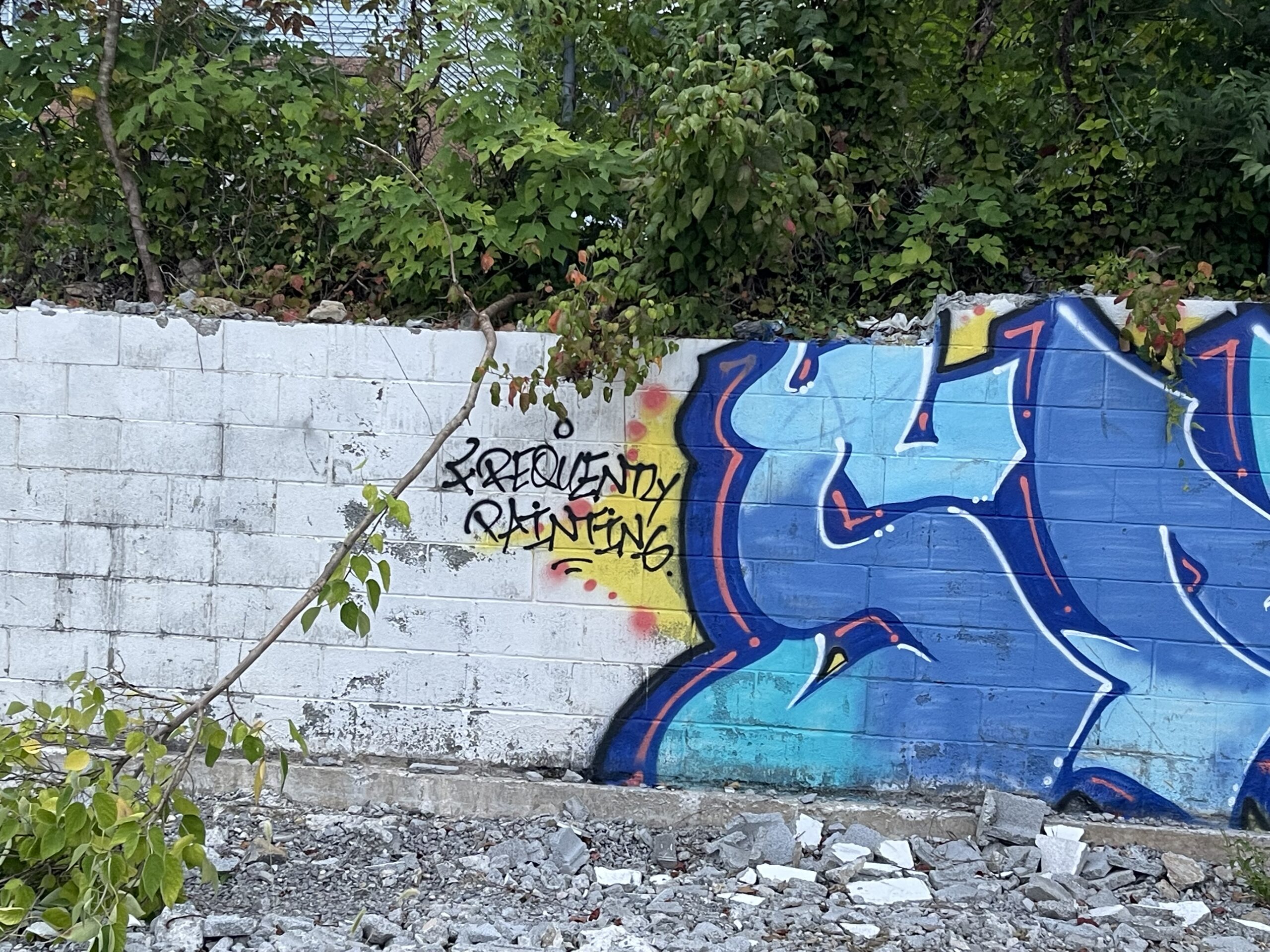


Ha! I enjoyed this!! Frequently painting may show up in many places!
I’m glad that you’re frequently blogging, Chris.
I admire you for continuing to blog daily, Ann, and I’m glad that you do.